I’ve heard about Power BI and Power BI Desktop a lot, but have never tried these tools before. So I decided to make an analysis of some popular questions and answers forum - http://sharepoint.stackexchange.com with help of Power BI Desktop. If you are SharePoint person (developer, admin, power user, etc.) that’s a big chance that you have visited this site before or maybe you are even frequent visitor. In this post, you will find a lot of images, graphics, trends, tables, maps, charts and so on. All made with great tool Power BI Desktop and Stack Exchange API as a data source. Some advanced data was collected with help of Google Maps Geocode API and nodejs webpages scrapper – osmosis.
The data was grabbed from sharepoint.stackexchange at the beginning of January 2017. Most of the data is filtered starting from the 2010 year because a relatively small number of questions were created before 2010 (around 200).
NOTA: all thoughts here are just my thoughts and may be incorrect or not aligned with yours. Please, share your opinion in comments.
Basic data
Let’s start with some basic information available:
TOP 250 tag cloud for SharePoint all time:

TOP 250 tag cloud for SharePoint in 2016:

Just for comparison and for the info, here is tag cloud for TOP 250 tags from StackOverflow:

Did you notice in the right? Yes, sharepoint is in the top 250 tags from SO :)
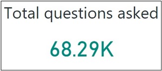
Questions
Now let’s see some interesting data around questions.
Here are questions by state: Not Answered, Answered, Has Accepted Answer:

That’s interesting. You see, that the number of accepted answers for 2016 is 20% lower and there are a lot more unanswered questions. Of course, some answers for questions in 2016 will be given in future, but you will see later in the post, that this is a general trend:
The number of unanswered questions is increasing
For comparison here is questions by a state from SO with tag C# for 2016:
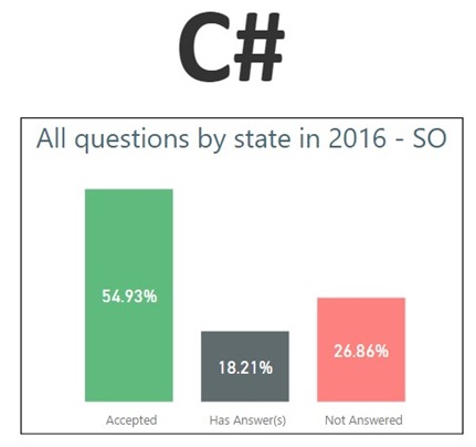
The number of accepted answers a bit higher, but in general you see graphs are similar.
Now let see questions state trend for SharePoint, per month:
Let also take a look at questions count per month trend:

or per year:
The number of questions per year is increasing
These graphs give us some clues about the nature of an increasing number of unanswered questions. With an increasing number of questions and a fixed number of answerers, we will see this trend. That’s my guess – the number of people who regularly answer questions on sharepoint.stackexchange remains the same or even slightly decreasing, from the other side number of questions is increasing. That’s why we see the number of unanswered questions is also increasing.
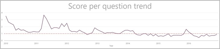
This graph also proves this idea:
Average answers count per question is decreasing and in 2016 became less than 1 answer per 1 question.
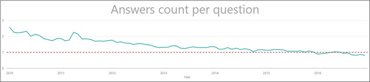
If you are curious how many scores one question receives, here is your graph:
Average score question receives = 1
You want some anomalies? Here you go. InfoPath was deprecated a few years ago and gradually becomes outdated technology. Take a look at the screen from Google Trends around InfoPath:

Now consider a number of questions per year with “InfoPath” tag on sharepoint.stackexchange:
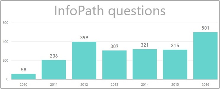
In 2016 users asked 40% more questions about InfoPath
I don’t know the exact reason for that. Maybe this is because of MS Flow and Power Apps – more questions about how to replace InfoPath.
Enough about deprecated technologies, what about modern trends?
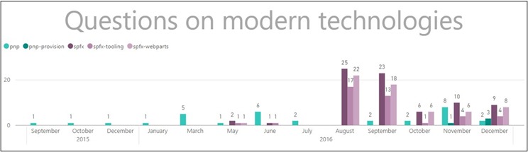
The number of SPFx and PnP questions is still relatively small
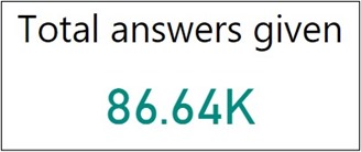
Answers
Let’s start with some basic info about how many answers were given per month, trend:
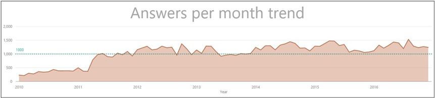
This graph also proves the theory about increasing unanswered questions. Total questions growing, but answers is not growing over time, that’s why we have more and more unanswered questions.
While the number of questions is growing per year, the number of answers is not growing and remains nearly the same from 2012
Do you want to know if an answer is upvoted (at least one time) or not? Then take a look here:

Starting from 2014 the number of “zero” scored answers is increasing
Maybe some answers will be upvoted in future, but I don’t believe that this number will be big. I tend to think this is general trend – increasing “zero” scored answers. Do you know why it’s happening? I don’t know, just guessing – the quality of answers are poor, too many answers, too many newcomers (they don’t know about votes system, etc.). One interesting conclusion follows from the above trend:
If you give an answer, that’s 50% chance that your answer will be upvoted at least once
Give 1K answers and you will receive 5K+ reputation (one upvote is 10 reputation) with 100% probability (not random answers, but valid) :)
Here is also accepted vs NOT accepted trend:

If you give an answer, that’s 30% chance that your answer will be accepted
So from your 1K answers, at least 500 will be upvoted (5k+ reputation) and around 200 will be accepted (I think those which upvoted might be accepted) which give additional 3k reputation. That means your 1K answers give you 8k+ reputation with 100% probability. Of course, your answers should be accurate :)
Now I’m interested in how many upvotes answers receive, per month trend:
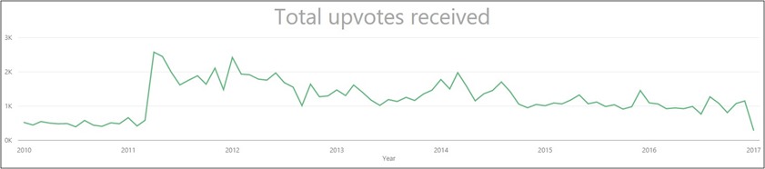
This trend indicates how active users are on the site and how often they are using the upvote button. During 2015-2017 upvotes rate is almost the same.
And score per answer trend:
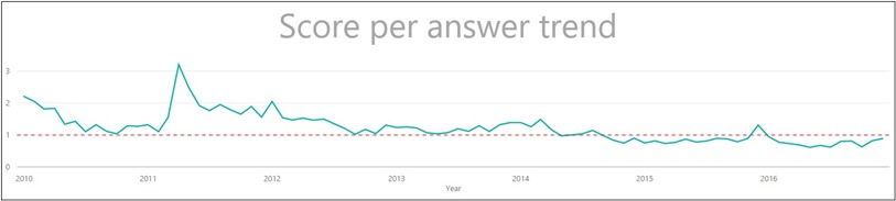
10 is an average reputation gained by an answer.
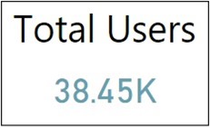
Users
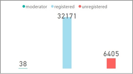
Just to refresh your memory from beginning of the post:
There are three types of users returned by stack exchange API: registered, unregistered and moderator. Here is our users divided by these categories (I’m not sure what exactly “unregistered” user means here):
I’ve also noticed that there are a lot of users without any meaningful stats, ie. upvotes\downvotes, questions and answers. I called those users “Inactive”. Inactive users have “Participation” equal to 0:
Participation = sp_users[up_vote_count] + sp_users[down_vote_count] + sp_users[answer_count] + sp_users[question_count]
Participation = 0 means that user didn’t take any valuable action on the site (no upvotes\downvotes, no questions and answers):
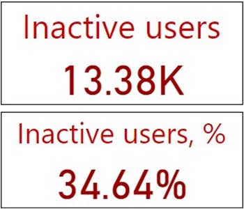
34% of all users didn’t ask or answer a question, as well as didn’t upvote or downvote
Power BI Desktop also allows you to create nice map visualizations. SE API provides location data, but location data is very different for users, from the other side Power BI accepts unified format. I was interested in users’ country, in order to grab the country I’ve used Google Geocoding API. Geo API allows you to send 2500 geolocation requests per day for free, but there are around 11K users on StackExchange with location data. So I had to switch proxy several times to grab the info in one day :)
So here are our users by countries (bigger circle indicates more users):
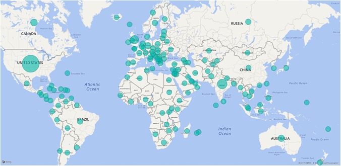
On sharepoint.stackexchange there are users from Bermuda, Maldives, Federated States for Micronesia, Reunion, Mauritius, Madagascar, Faroe Islands, Fiji and French Polynesia.
Let’s see the accept rate distribution:
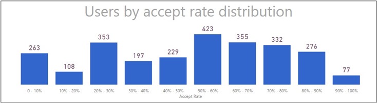
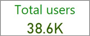
There is no much info about accept rate because SE API uses some internal algorithm for showing it (minimal number of question should be asked, some of them should be accepted, etc.). Most of the users don’t ask or ask 1-2 questions, that’s why for such users no accept rate data available. From this graph you see only 2.7K users out of 38K have accepted rate value, for others it’s null.
For all below graphs, I excluded 13.38K inactive users from the analysis (do you remember, those who have Participation = 0), because they affect graphs, but doesn’t bring any useful information.
Let’s see first answers distribution by users (how many answers the user has, x-axis – count of answers, y – count of users):
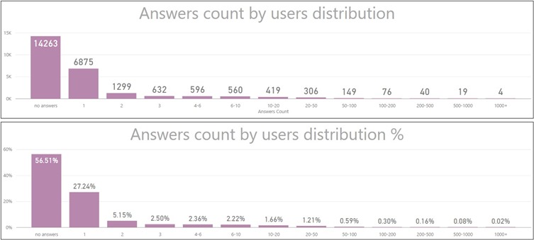
84% of all users have 0-1 answer on sharepoint.stackexchage
4 users having more than 1K answers! That’s impressive, later will see who’s that.
Now take a look at the similar graph, but with questions distribution (how many questions the user has, x-axis – count of questions, y – count of users):
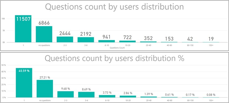
72% of all users have 0-1 question on sharepoint.stackexchange
Let’s see how many new users were registered each year:
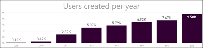
Every year the number of new users is increasing in comparison to a previous year and that’s good. That mean interest is increasing over years.
Here are users upvotes distribution (how many upvotes user has, x-axis – count of upvotes, y – count of users):
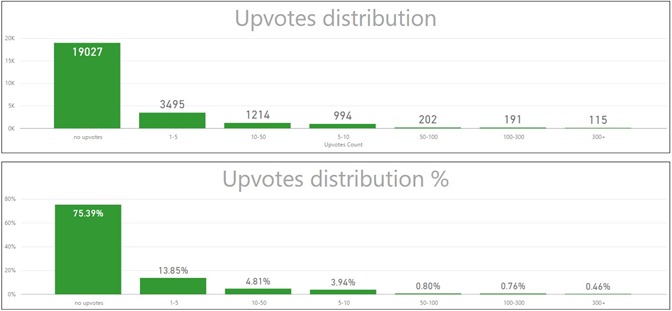
Do you see? 75% of all users have never upvoted on sharepoint.stackexchange. Below interesting conclusion based on the analysis of the graph above:
1% of all users generate 70% of all upvotes on the site
From my point, that’s not good. That’s mean users are not active and don’t use upvote button too often. Or maybe newcomers don’t know how and when to use it.
If you are curious who are that “upvoters”, here you go (TOP 10 users by the count of upvotes):
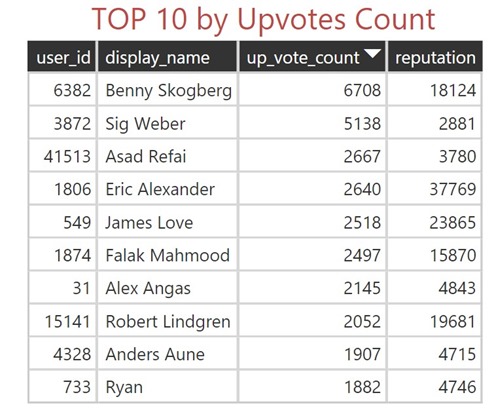
You see, users with significant reputation usually upvote much on the site. Sig and Benny upvoted more than 5K times! That’s incredible!
Let’s continue with different other TOPs I’ve created based on different params.
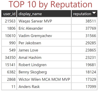
Of course, TOP 10 by reputation (this data can be easily views on the users page):
TOP 10 by the count of answers:
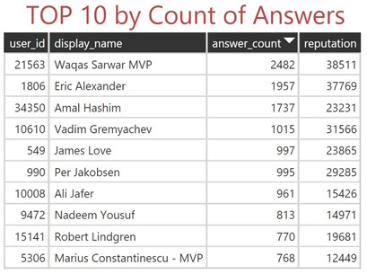
Eric and Amal approaching 2K answers, Waqas leave 2K far away! That’s absolutely awesome work by all of the top answerers!
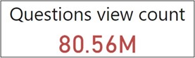
That’s also one interesting attribute inside user profile called impact. When you click on the user profile, you will this attribute (people reached):

Stack Exchange explain it as
Estimated number of times people viewed your helpful posts (based on page views of your questions and questions where you wrote highly-ranked answers)
In other words, this param indicates how often your questions and highly-ranked answers were viewed by other people. Be default SE API doesn’t provide such information, so I had to grab it using nice and easy to use nodejs module called osmosis. Here is our TOP users having impact > 1m:
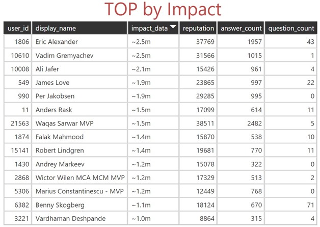
How to read above table: for example, Eric and Vadim have 2.5 million views of their answers (because of the number of questions relatively small). Vardhaman has 1 million views with the lowest number of answers. Probably that means Vardhaman answered on many popular questions which are in the top of Google. Having impact for all users I decided to calculate, how many impact generated by top users. And found that interesting statement:
1% of all users generates 50% of impact (in other words 50% of traffic for sharepoint.stackexchange)
Let also see TOP 10 users by impact per post:
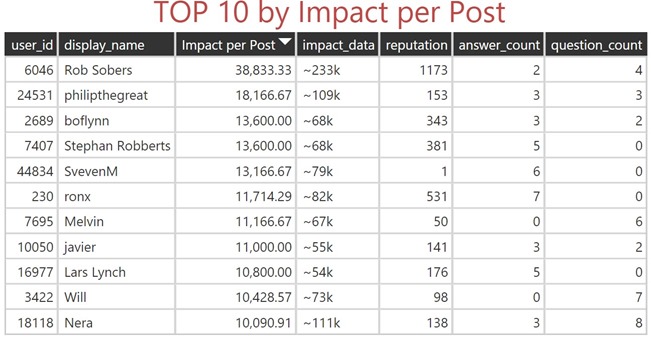
Rob has only 6 posts (2 answers and 4 questions) but received 233K views.
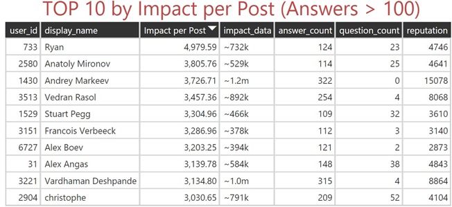
I filtered users by the number of answers more than 100 to see the impact per post for top answerers:
 And the last table of TOP users by reputation gained per post:
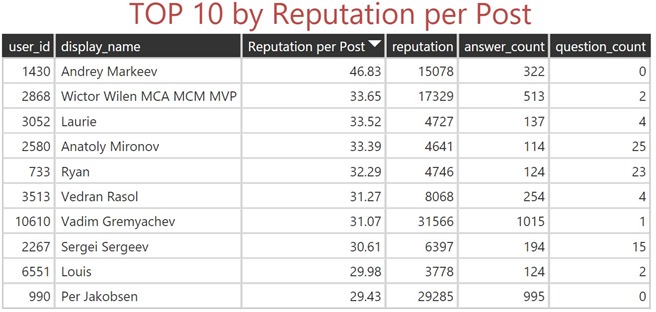
Andrey is the most effective answerer here – gained 15K reputation based on 322 answers.
The End!
From this analysis and stats, I would say that interest in SharePoint is still increasing. The 2016 year brings a lot of new users and questions, in comparison to 2015. Also, I want to say thanks to all users who help others by providing answers because this is the only condition for the site to be alive – when you are receiving an answer to your question.
I’m glad to see your thoughts on this data in comments.
If you interested in source code used for gathering data, you can find it here on GitHub – StackAnalysis
There is also Power BI Desktop project with data I used available for download Stack Analysis Data.zip (39.89 mb).